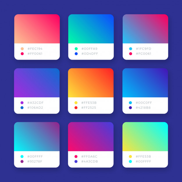
When most ecommerce website owners are questioned about the reason they chose a particular colour, colours, or colour scheme for their website, they usually reply with blank stares and vague shrugs. The most they’ll say is that they like the colour, or they simply picked on off the top of their head, or the person deciding their website just gave it to them. The problem here is that ecommerce website owners are missing out on a large opportunity that they can use to convey the personality and branding that they wish to be associated with. Potential customers can be greatly influenced throughout their shopping experience by these colours, and can subconsciously form opinions about the business.
The study of how colours can affect the subconscious mind is referred to as ‘colour psychology.’ Since the brain is conditioned to associate certain colours with specific characteristics, emotions, and values, it can be a massive advantage to the overall image your website is attempting to make. For example, dark blue shades may give off an impression of intellect and stability, while violet and gold symbolize wealth or royalty. Similarly, if you think about it, you will be able to identify your own biases and associations with different colours that have formed over the years. Below, we explain how you can use this psychology to your advantage while making your ecommerce website.
COLOURS AND ASSOCIATIONS
Each colour has a specific meaning, emotion, or energy that is associated with it. While choosing your colour scheme, aim for colours that closely match the nature of your service or product, and the values that your business is built upon. Each colour can have different meanings in different cultures, so you will also have to understand the historical and cultural associations that colour holds for your target audience. The same white colour may be perceived as peace in one region, and a sign of weakness in another. Black may stand for elegance for some, while it stands for evil to another. Understanding your target audience correctly is essential if you want colour psychology to play out well with your website colour scheme. There are certain colours such as brown, tan, grey, and beige shades that inherently give off a more sturdy, reliable vibe. There are others such as warm yellow or bright orange, that immediately draw the mind to thoughts of energy. Thinking how emotions and perceptions are affected by these colours can help you decide the best ones for your ecommerce website.
COLOUR AND PRODUCT RELATIONS
While choosing colours with different significance is important; you also have to make sure that your colour relates to the product. In the same way that bright pink, orange, or sunny yellow may not sit well with luxury brands or products, blacks, greys and desaturated colours will not work well for a line of baby products. Even though grey may communicate a sense of reliability, in this case, it does not link to the product, and your website would fail. There is research to show that the colours which are used on ecommerce sites can increase or decrease sales and turnover over even short periods. Hence, make sure you evaluate the colour scheme in terms of its relation to the commodities you are selling.
ISOLATION EFFECT
The isolation effect is an excellent way to use colour to draw or retain attention upon particular elements. Over some time, you can condition the potential customer to focus on specific things throughout your site by just using the same colours for relevant information. This can help when you are attempting to highlight particular products or services or have specific information that you want the customer to remember. Colour isolation is a powerful way to influence the customer’s mind and to make sure that they subconsciously follow the flow of your website that you intended. Moreover, training their mind to click specific buttons because of associations, is a tactic used on some good ecommerce websites that have proven good results.
Remember the amount of thought and effort required when choosing ecommerce website colour scheme, because these can make a huge difference in your business’s overall performance. If you are unsure about how to proceed with this, try contacting experts. Hopefully, these tips will help you improve the colour psychology usage throughout your ecommerce site. Good luck!


